The Best Website Review Sites of 2025: Top Designs & What You Can Learn From Them
 2025.10.19 20:43
 petro
petroLooking to build your own website review platform or just curious about the best in the business? Here’s a roundup of the top website review websites in 2025, each with unique design elements and user experience features worth studying.
1. Trustpilot
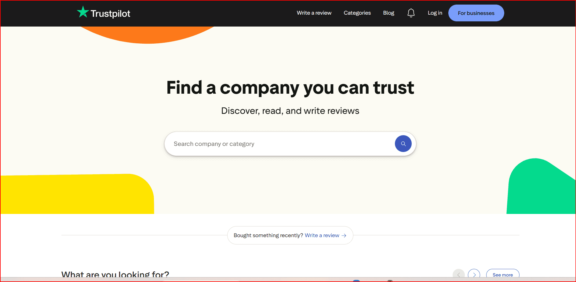
URL: trustpilot.com
Clean, simple, and user-friendly. White backgrounds and blue accents create a trustworthy vibe, emphasizing genuine customer reviews with easy navigation and clear categories.
Design takeaways:
- Reliable, user-generated reviews
- Sleek, minimalistic interface
- Smooth, intuitive navigation
2. TripAdvisor

URL: tripadvisor.com
Bright and inviting, TripAdvisor balances white space with green and orange accents to create an interactive community feel for travelers. The focus on destinations, hotels, and restaurants makes browsing simple and enjoyable.
Design takeaways:
- Plenty of white space for clarity
- Community-driven content
- Clean, neat layout
3. Yel

URL: yelp.com
Yelp’s red and white color scheme brings local businesses and events to the forefront. User engagement thrives with photos, comments, and easy-to-explore categories.
Design takeaways:
- Calm, pleasing color palette
- Easy menu navigation
- Strong visual elements
4. ConsumerAffairs
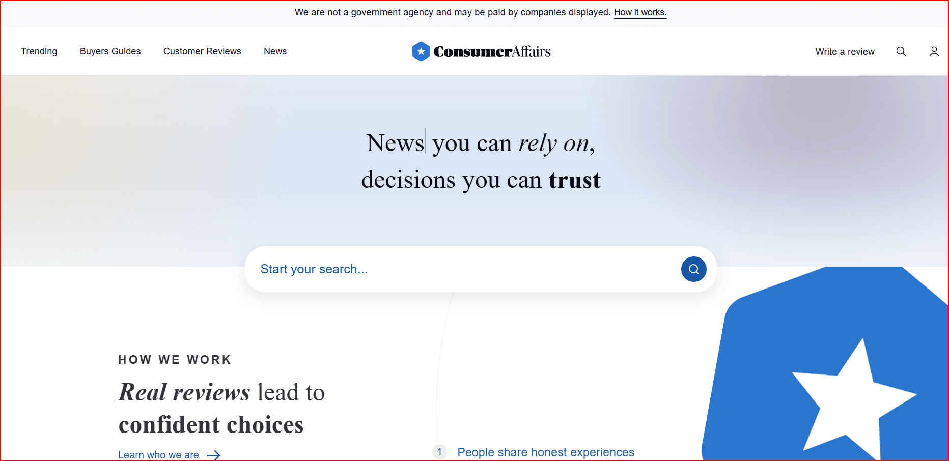
URL: consumeraffairs.com
Simple design with blue accents, focusing on transparency and consumer trust. Great for navigating industry-specific reviews and top products.
Design takeaways:
- Simple color palette
- Clear navigation
- Clean and sleek design
5. FourSquare
URL: foursquare.com
Modern and fresh, FourSquare highlights personalized recommendations with a user-friendly, location-based design perfect for discovering new spots.
Design takeaways:
- Calm, easy navigation
- User-friendly layout
- Emphasis on personalizatio
6. TrustRadius
URL: trustradius.com
Sleek with a white and blue palette, showcasing detailed software reviews and trending categories.
Design takeaways:
- Creative visuals and logos
- Well-researched reviews
- Intuitive navigation
7. G2
URL: g2.com
A bold, dark-themed design with white and orange highlights that encourage interactive exploration of software reviews and data-driven insights.
Design takeaways:
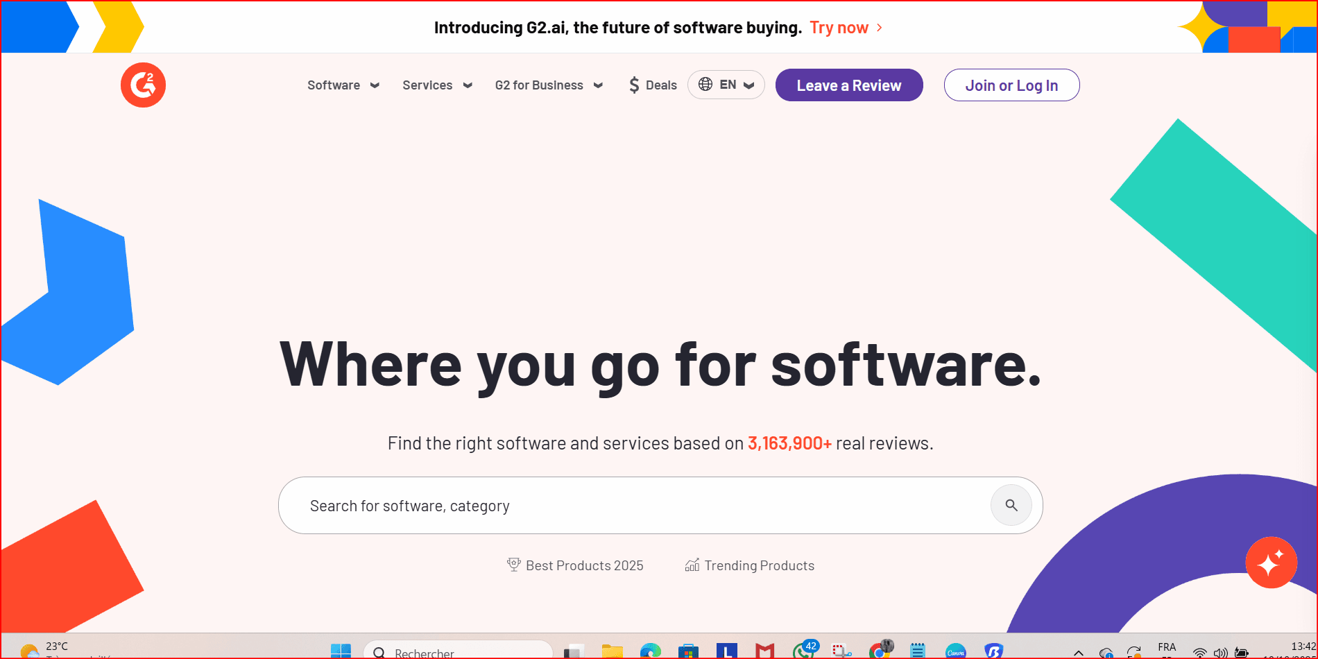
- Unique color scheme
- Smart use of white space
- Easy navigation
8. GoodFirms
URL: goodfirms.com
Professional and clean, focusing on detailed business profiles and transparent client feedback.
Design takeaways:
- Trusted, real reviews
- Polished layout
- Simple color scheme
Bonus: Wix
URL: wix.com
Not a review site but an example of stellar web design, Wix impresses with playful yet clear CTAs and a fantastic user experience.
Design takeaways:
- Playful, engaging design
- Clear calls to action
- Great UX
Quick Tips for Building Your Own Review Website:
- Start with a customizable template to save time.
- Use a website builder like Wix (try 14 days free!) for an easy drag-and-drop experience.
- Focus on clean design, simple navigation, and authentic reviews to build trust.
- Include lots of visuals and user-generated content to boost engagement.
- Keep the layout uncluttered and easy to scan.
FAQ Highlights:
- What makes a good review website design? Clean, easy-to-navigate layouts with plenty of social proof.
- How much does it cost? DIY can be under $100; professional design ranges $500–$800.
- What info is essential? Honest opinions, ratings, and visuals.
 Multi-Account Management
 Prevent Account Association
 Multi-Employee Management
Recommended
See More ![]()